
HN repeatedly recommends it as a surprisingly magical explainer on color perception, often cited in color-space discussions.
Topics › Design, Graphics & Visual Media
The best graphic design & typography videos, according to Hacker News
38 videos about graphic design & typography that Hacker News commenters keep pointing each other to, ranked by how many separate months they were recommended. Part of Design, Graphics & Visual Media.

HN uses it as the go-to short piece against pedantry and for language change, recommended whenever grammar disputes come up.

Frequently recommended as an absorbing look at hot-metal typesetting and the end of the linotype era.

HN recommends it as an entertaining look at how hard notation fonts are to make, and it comes up in threads on music engraving and open source.

HN treats it as the definitive, short, well-made video on mouse cursors and pulls it out whenever cursor design, pixel perfection or the tilted arrow comes up.

Tom7 is an HN favorite, and this video is praised as hilarious, educational silly ML that keeps getting better.

HN cites it as the accessible go-to explanation of gamma and color blending errors in image programs.

HN treats it as the go-to short explanation of UTF-8, praised for making the topic stick.

HN people recommend it as an entertaining, surprisingly deep talk that comes up whenever encodings, mojibake or Unicode are discussed.

Recommended as the quickest way to see what TeXmacs can do, as a WYSIWYG alternative to LaTeX.

HN points to it as proof that a small, straightforward renderer can beat Windows Terminal on speed and memory, whenever software slowness comes up.

HN commenters bring it up whenever Microsoft product naming, branding or marketing is confusing, pointing to it as a long-running self-aware critique.
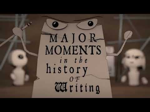
HN recommends it as a fun, amazing overview of writing systems whenever the alphabet or cuneiform comes up.

Recommended as a meditative, geeky tour of alternative display designs.

HN holds it up as a masterclass in explaining and selling a design.

HN people recommend it as an entertaining example of great effort on a trivial problem, and cite the template in LaTeX-versus-Word discussions.

HN readers point to it as an example of Tom7's ridiculous-but-brilliant programming projects, here tied to license parody and typesetting.

The canonical reference on flag and logo design principles, cited in branding and design threads.

Recommended for readers who enjoy fascinating deep dives into the history of odd letters and the alphabet.

HN people recommend it as personal inspiration for perseverance and for keeping perspective by remembering mortality.

Commenters point to it as the clearest explanation of Python's bytes versus Unicode model and the Unicode sandwich, which finally makes the confusion click.

HN commenters share it for Jobs's account of Rand's single-option approach and as a lesson in trusting designers.

Pointed to as the standard introduction to SILE as a modern TeX alternative, though possibly dated.

Recommended alongside the original paper and Unix history threads as an engaging account of the typesetter hack.

Praised as a standout example of kinetic typography that holds attention, and known as the earlier work that led to the animator's Weird Al 'Word Crimes' video.

Linked whenever flag redesigns come up, and credited as hugely influential on how people think about flag design.

Mentioned as a delightful stunt whenever emoji input or keyboards come up.

HN recommends it for its insight into Knuth's TeX algorithms and what changes when they are rewritten functionally.

HN mostly drops it jokingly in threads about grammar, apostrophes and language, and occasionally discusses the animated video's making.

Recommended in threads on freelance design pricing and why large corporations pay a lot for branding work.

HN commenters point to it as the history of phototypesetters and a story about the freedom to control your own hardware.

Shared as a funny companion to logo-redesign and branding stories.

HN points to it as an accessible explanation of how color and reflected light behave, especially under LED lighting.

Cited as an example of quirks caused by non-geographic maps and design choices in transit systems.

Cited as an example of colors too vibrant for monitors and pigments outside the sRGB gamut.

HN invokes it as a joke reference in threads about fonts, typefaces and one-upmanship.

Linked in threads on the Tube map and transit map design history.

Posted as a joke in threads about typefaces and typography.
Which of these have you already seen?
Connect YouTube and HackerTube AI hides what you've watched and ranks the rest for you.